
HyperWork officially announces its rebranding campaign, Collaboration is the Core, marking a strong transformation for its next journey.
Starting April 2025, HyperWork will introduce a refreshed logo and brand identity. This reflects a commitment to building a sustainable connected ecosystem after nearly 5 years of accompanying hundreds of thousands of users.
A 5-year journey and a new beginning
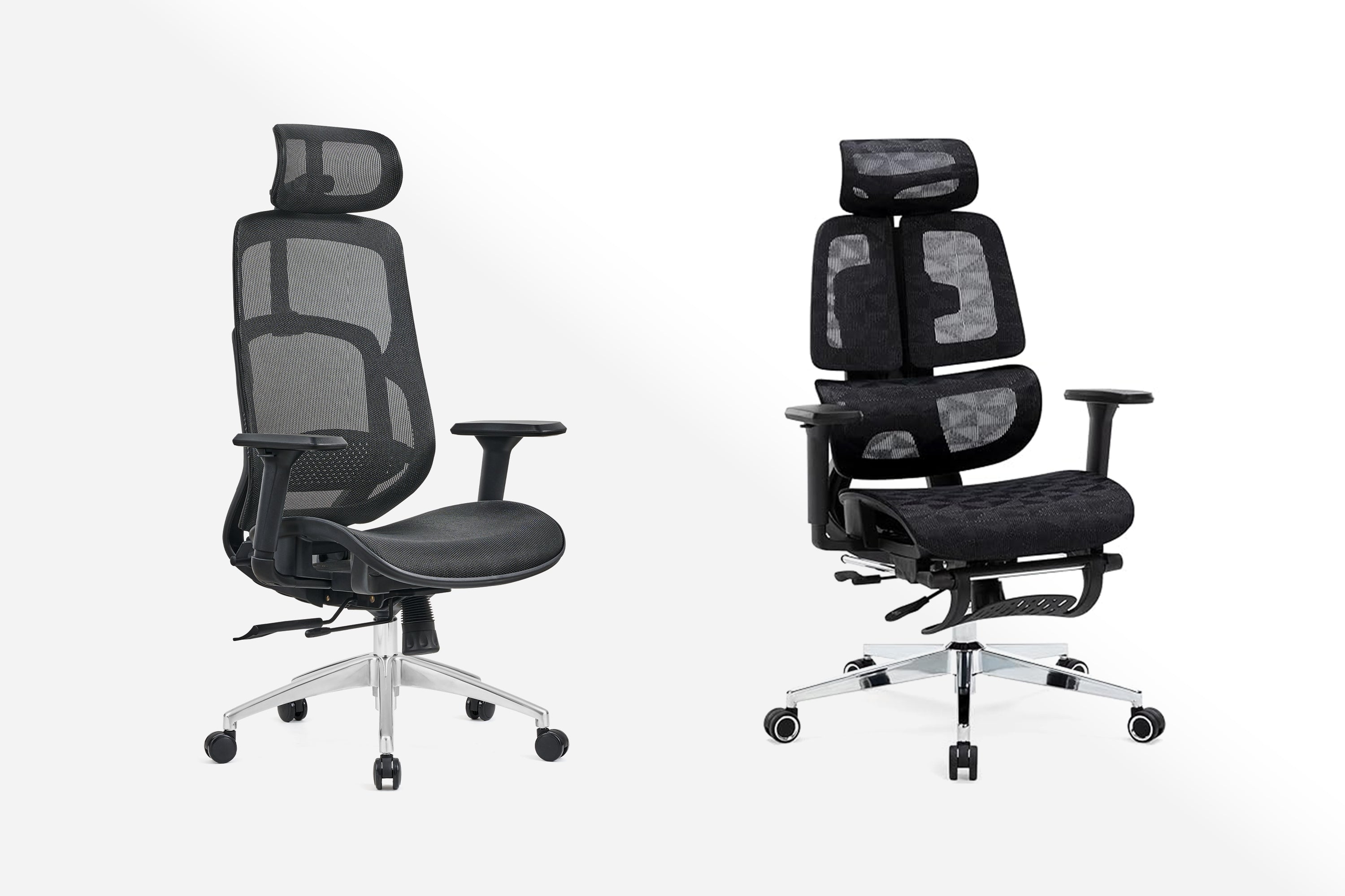
Over the first 5 years, HyperWork has continuously strived to bring new products and solutions to individual users, accompanying customers and partners on the journey to enhance performance. From its initial steps with a pioneering spirit, HyperWork has built a convincing product ecosystem, leaving many significant marks.
This logo change, though a small step, is the beginning of a larger journey. HyperWork aims not only to continue developing but also to expand, emphasizing collaboration as the foundation to reach new milestones of success with its partners.
New Logomark - Where collaboration is strength
Previously, HyperWork's logo was inspired by the image of a rocket, symbolizing breakthrough and speed, reflecting a fierce individual journey.
With this change, we aim to shift our approach to a broader customer base, especially businesses. The new logo reflects HyperWork's commitment to creating solutions that foster cohesion among individuals in a corporate environment, where collective strength is maximized to achieve common goals.

HyperWork's new logo is inspired by mechanical keyboard switches – the catalyst for the development of the product ecosystem that the brand has continuously researched and refined. The highlight of the logo is the "+" shaped logomark, carrying a deep meaning of synergy and expansion. The "+" sign is not just a symbol, but also an affirmation of the core role of collaboration in HyperWork's next development journey:
-
Collaborate, reach further: The "+" sign affirms the important role of partners – from manufacturers to media agencies – in expanding HyperWork's vision and value, taking steps on a new journey together.
-
Resonate, create value:
+) The "+" sign represents a closer connection between products in the ecosystem, providing a seamless experience.
+) At the same time, the "+" sign reflects the desire for HyperWork's products to contribute to connecting individuals within businesses, where each person and each team, when working towards common goals like aligned vectors, will achieve maximum value. The brand is committed to developing advanced products while fostering teamwork, moving towards success with customers and partners.
In the upcoming period, HyperWork expects to create a sustainable resonant network, where every touchpoint – from customers, partners to internal staff – develops together and achieves new accomplishments.
Activities within the Collaboration is the Core campaign
Within the scope of the campaign, HyperWork is implementing several activities to communicate and promote to its esteemed partners and customers, including:

- Changing packaging, website interface, e-commerce platforms, communication channels, POSM items, shared documents, and employee uniforms;
- Launching a series of new products in April and May to spread the new identity;
- Customer appreciation events with attractive offers.


Leave a comment
This site is protected by hCaptcha and the hCaptcha Privacy Policy and Terms of Service apply.